一张家具产品图可以延展成多张 campaign 素材,但不要只做不同尺寸的重复裁切。更稳的做法是先确定一个可信视觉方向,再让每张衍生图分别服务首屏、详情、广告、邮件或移动端版式。
很多家具上新项目的问题不是素材太少,而是素材之间没有系统。团队先做一张 Hero 图,然后临时要一张社媒图、一张邮件图、一张落地页图、一张商品页辅助图。最后素材数量变多了,但产品在不同画面里看起来不一致,用户也不一定获得更多有效信息。
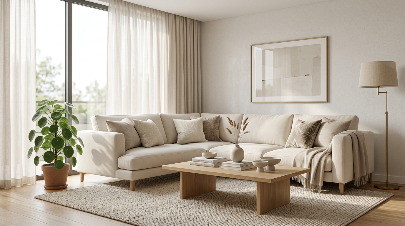
这类图适合作为 campaign 起点,因为它既能展示产品,也保留了版式空间。后续可以从同一方向延展横幅、详情图和移动端素材。
先定义问题:campaign 需要的是素材系统
家具 campaign 通常需要很多位置:
- 商品页 Hero
- PDP 辅助图
- 系列页或落地页模块
- 邮件头图
- 社媒或广告素材
- 移动端竖版图
- collection tile 或分类入口图
如果每个位置都重新生成一张“看起来不错”的图,素材很容易失控。房间变了,光线变了,材质感觉变了,产品也开始像不同版本。
正确的问题不是“还能多生成几张吗”,而是“这次 campaign 还缺哪种视觉任务”。
判断清单:每张衍生图都要有一个新任务
在把一张产品图延展成多张素材前,可以先问:
- 原始产品图是否足够可信,轮廓、比例和材质是否清楚。
- 第一张 Hero 是否已经确定产品方向和空间调性。
- 新增素材是否承担不同任务,而不是重复 Hero。
- 横版、竖版、近景和细节图是否共享同一产品身份。
- 光线和材质是否在整组素材中保持稳定。
- 每张图是否有明确使用位置。
- 如果删掉这张图,campaign 是否会少一个必要答案。
如果删掉某张图没有任何影响,它大概率是冗余素材。
campaign 素材不是每张都要满画面展示产品。有些图的任务是给文案和按钮留位置,同时保持产品方向一致。
从一个视觉锚点开始
不要一开始就同时要六张图。
先做一张能作为锚点的图。它应该确定:
- 产品真实外观
- 主要空间类型
- 光线方向
- 画面气质
- 色彩和材质表达
- 后续可延展的构图空间
锚点图不是最终全部素材,但它决定后续素材是否统一。家具类 campaign 尤其需要这个步骤,因为产品体量大、材质敏感、空间关系明显,任何小漂移都会让整组素材显得不可靠。
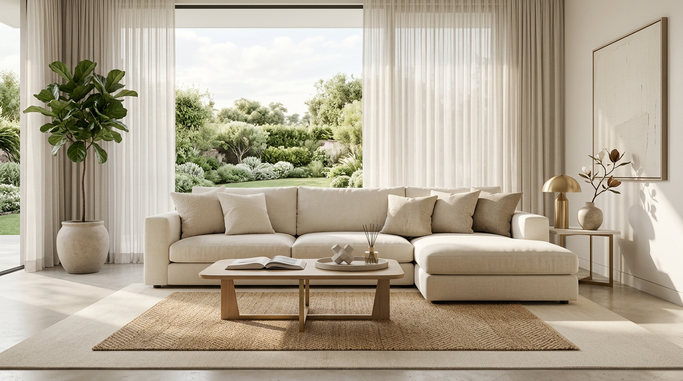
客厅图可以承担生活方式沟通,但它仍然要继承锚点图里的产品事实。campaign 统一感来自产品、光线和空间逻辑,而不是简单套同一个滤镜。
最常用的 4 类 campaign 衍生素材
一张家具产品图延展时,可以优先考虑四类素材。
1. Hero 或主视觉图
这是 campaign 的第一印象。它需要让用户快速知道这是什么产品、适合怎样的空间、是否值得继续看。Hero 图可以更有氛围,但不能让产品变成背景道具。
适合位置包括:
- 商品页首图
- 上新落地页首屏
- 系列页顶部模块
- 品牌活动横幅
2. 版式适配图
这类图的任务是让设计和投放更灵活。
它可能是更宽的横版,也可能是更高的竖版,或者是留出左侧、右侧空间的构图。重点不是重新创作一个场景,而是在不改变产品故事的前提下适配不同版位。
适合位置包括:
- 邮件头图
- 移动端广告
- 首页模块
- collection tile
- 社媒封面
3. 证明型素材
这类图要回答用户的实际疑问。对家具来说,它可能是材质近景、坐感结构、桌面厚度、椅背曲线、柜体细节或边缘收口。
证明型素材不一定最适合投放第一屏,但很适合支持商品页、落地页中段或再营销素材。它让 campaign 不只好看,也更可信。
4. 场景近景或情境图
这类图介于 Hero 和细节之间。它保留一部分空间故事,但更靠近产品。它可以用于邮件、落地页中段、社媒轮播或广告第二张图,帮助用户从“喜欢这个氛围”进入“理解这个产品”。
如果产品适合多个空间,情境图可以扩展使用场景。但每次扩展都要检查产品身份是否稳定,而不是为了多样性牺牲一致性。
适用场景:什么时候适合从一张图延展整组素材
以下情况适合采用一图多素材工作流:
- 已有一张可信产品图或已经批准的 Hero 方向
- 需要快速准备上新 campaign
- 商品页、广告、邮件和社媒都缺素材
- 同系列家具需要保持统一视觉
- 团队希望先验证视觉方向,再决定是否扩大制作
- 需要从一个产品方向生成横版、竖版、近景和详情图
这类工作流的重点是减少重复 brief,让素材围绕同一个产品事实展开。
不适用场景:什么时候不建议这样做
以下情况不建议直接从一张图延展 campaign:
- 原始产品图不准确,材质和比例无法信任
- 新品还没有定稿,结构或颜色可能变化
- campaign 需要展示真实可动结构,但没有可靠素材
- 每个渠道需要完全不同的创意概念
- 团队只是想快速“多出几张”,但没有定义用途
- 合规或渠道要求必须使用真实拍摄素材
一图多素材不是万能捷径。它更适合把可信产品图变成一套有秩序的商业视觉,而不是替代产品确认和策略判断。
常见失败原因
第一种失败,是把同一张 Hero 图裁成很多尺寸。尺寸变了,但信息没变,广告和商品页都没有获得新的说服点。
第二种失败,是每个素材都换场景。看似丰富,实际让产品身份变得不稳定。
第三种失败,是忽略版式。横幅没有留文案空间,竖版裁切切掉关键结构,移动端图里产品太小,这些都会影响使用。
第四种失败,是没有证明型素材。campaign 很漂亮,但落到商品页时,用户仍然不知道材质、结构和使用价值。
第五种失败,是没有命名和用途管理。团队生成了很多图,却不知道哪张用于邮件、哪张用于 PDP、哪张用于广告测试。
一个可执行的 campaign 素材结构
可以先用这个轻量结构规划:
- Anchor Hero:确定产品和空间方向。
- Wide Layout:适配落地页、邮件或首页横幅。
- Vertical Layout:适配移动端、社媒或广告。
- Proof Shot:说明材质、结构或舒适度。
- Context Close-up:保留场景,同时更靠近产品。
- PDP Support:补足尺寸、比例或细节问题。
这不是固定模板,但能帮助团队避免“每张图都重新开始”。
TouchHue 工作流位置
TouchHue 适合放在“锚点图已经确定,需要把它延展成多用途 campaign 素材”的阶段。
可以这样使用:
- 先上传可信产品图,生成或确认第一张视觉方向。
- 用 More Shots 延展同一方向下的横版、竖版、近景和详情图。
- 用 Retouch 修正局部边缘、材质或光线问题。
- 用 Style 在保持产品事实的前提下调整整体调性。
- 最后按渠道和用途整理素材,而不是只按生成时间保存。
更多方法可以看 TouchHue 如何工作。如果你要把家具产品图用于商品页、广告和上新素材,可以看 家具广告视觉与商品页素材。
FAQ
一张家具产品图真的能做出一整组 campaign 素材吗?
可以,但前提是原始产品图可信,并且第一张视觉方向经过审核。后续素材应该围绕不同用途延展,而不是随机生成不同场景。
campaign 素材越多越好吗?
不一定。素材多但任务重复,会增加选择成本。更好的做法是让每张图承担一个明确用途,例如 Hero、横版、竖版、证明图或情境图。
如何避免产品在不同素材里看起来不一致?
保持产品轮廓、材质、比例、光线逻辑和空间方向稳定。变化应该主要发生在构图、景别和使用位置上。
什么时候需要证明型素材?
当产品价格较高、材质是卖点、结构影响体验,或者用户需要更多信任依据时,都应该加入证明型素材。
一图多素材能替代完整 campaign 策划吗?
不能。它解决的是视觉生产和一致性问题,不替代定位、卖点、渠道策略和投放判断。
相关阅读
如果你已经有一张可信家具产品图,可以先用 TouchHue 做一张锚点图,再按 Hero、版式、证明和情境四类任务延展 campaign 素材。